
Service Page: 7 Essential Ways to Make Your Offer Clear

A service page should explain what you do, who it helps and what a visitor should do next. Attractive design cannot fill in missing information. Use this seven-part review to prepare useful content before asking a designer to arrange the page, and keep every claim tied to what your business actually offers.
In this guide
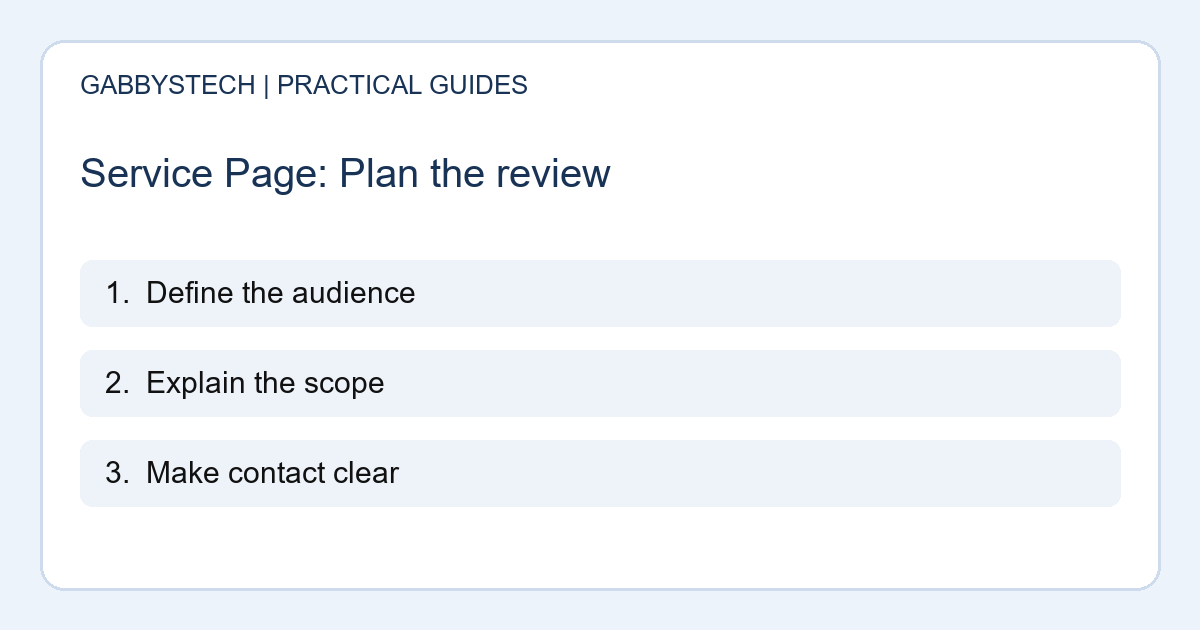
1. Give the service page one main job
Decide which service the page explains and which decision it should support. A broad list of unrelated offers can make it difficult for someone to find the right help. Write a short sentence naming the audience, the problem and the next step.
This is a planning exercise, not a formula to paste into every heading. For example, an assessment page can help a person explain symptoms and arrange a conversation. It should not pretend to deliver a confirmed diagnosis before anyone has examined the device.
2. Answer the first practical questions
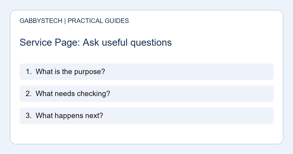
List the questions customers ask before contacting you. They may want to know whether the work is local or remote, what information to prepare and which tasks are included. Answer those questions in ordinary language. Explain necessary technical terms when they affect a decision.
A useful service page does not need to hide everything behind an enquiry button. At the same time, you should not invent details just to fill space. Where cost or timing depends on assessment, explain what will be discussed and which information helps establish the scope.
3. Make the process easy to follow
Describe the main stages from first contact to an agreed next step. Keep the explanation specific to the service. Website planning might involve content preparation and review, while a physical repair involves the device and a diagnosis. Do not make the two sound interchangeable.
Clarify where the customer needs to supply information or approve work. A service page is more useful when readers understand their own responsibilities. Avoid giving a fixed delivery promise unless your business can support it and the relevant conditions are clear.
4. Use headings that describe real sections
Break the content into questions or topics that people can scan. Headings such as scope, preparation, process and next steps are useful when the following paragraphs actually address them. Keep the hierarchy meaningful instead of choosing heading levels only for their size.
W3C’s writing guidance explains the value of descriptive headings and link text for accessibility. This is a good editorial starting point, but it does not replace a full accessibility review. Check the service page with the people who will maintain the content as well as those designing it.
5. Show evidence without inventing proof
Use examples, photographs or project descriptions only when you have the right to publish them and can explain what they show. A fictional illustration should be labelled as such. Do not turn an internal practice layout into a customer success story.
Keep testimonials and claims accurate and approved for use. If you do not have suitable evidence yet, a clear description of the service is better than fabricated results. The service page should give a visitor reasons to understand and trust the offer, rather than pressure them with unsupported superlatives.
6. Choose a clear action and explain it
Use a button or link that describes the next step. “Discuss your website” or “Request an assessment” gives more context than a vague “Go.” Tell readers what to include and what the form is intended to do. Keep alternative contact methods easy to find.
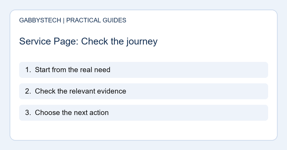
Then try the journey on a phone. Make sure the action leads to the right destination and that any form feedback is understandable. A service page that explains the offer well can still lose an enquiry if the final link is broken or the message reaches the wrong inbox.
7. Plan who keeps the details current
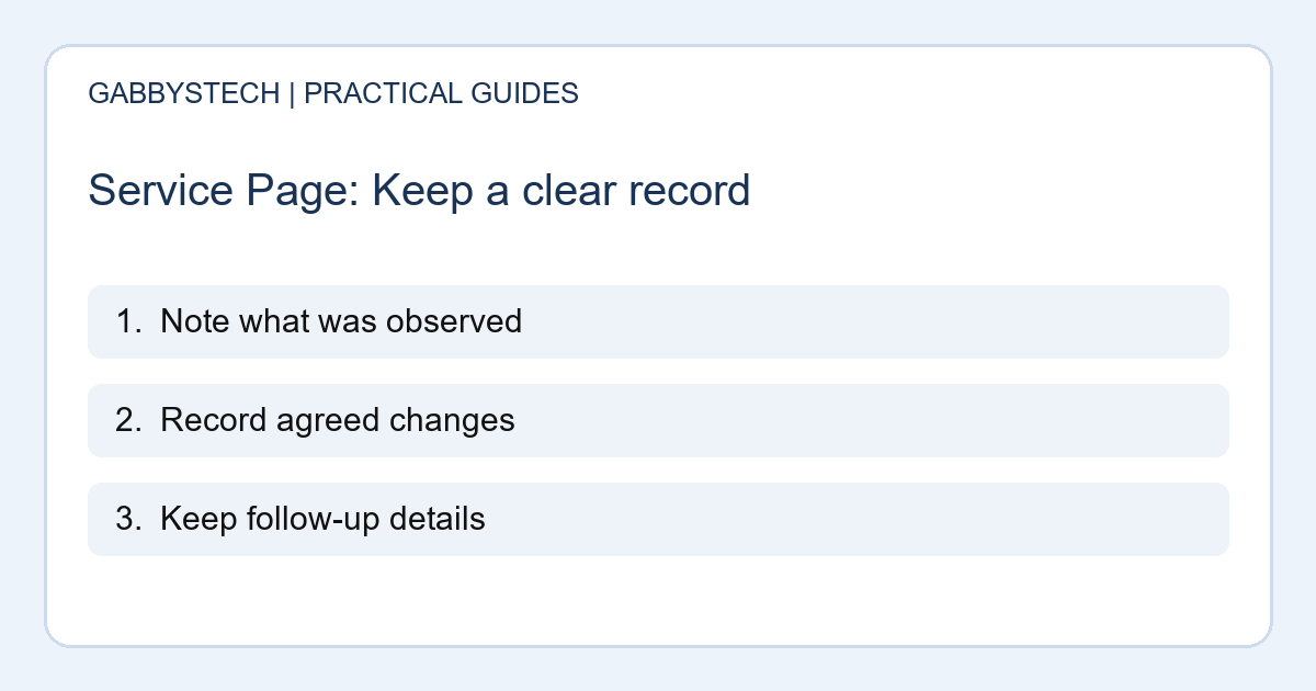
Give someone responsibility for checking the page when services, contact details or working arrangements change. Keep a simple record of what was reviewed and what needs confirmation. Old wording can create confusion long after a redesign looks finished.
Review the service page against actual enquiries. If people repeatedly misunderstand the same detail, improve that explanation rather than adding more promotional language. Treat the page as a useful business document that needs maintenance, with design and SEO supporting the reader’s understanding instead of competing for attention.
Sources and next steps
W3C’s writing tips cover helpful headings and meaningful links. Google’s people-first content guidance supports writing for readers rather than search manipulation.
Before launch, use our contact form review guide to check what happens after someone decides to enquire.
Need a clearer service page? Explore GabbysTech web design and development and discuss your website. Share the service, audience and information customers currently struggle to find.