
Mobile Menu: 7 Essential Checks for Easier Navigation
A mobile menu should help someone find the right page without hiding important options or trapping them on a small screen. Review its behavior as well as its appearance. These seven checks give business owners and designers a practical way to discuss navigation before launch or during a website improvement project.
In this guide
1. Keep the mobile menu focused
Begin with the destinations a visitor is most likely to need. Main services, contact details and account access may have different importance depending on the site. Group items by purpose rather than copying every link from the footer into the header.
Write down why each main item belongs there. A mobile menu can become difficult to scan when old campaigns and duplicate destinations accumulate. Remove or relocate items through an agreed content review, and make sure important pages remain reachable through another sensible route.
2. Make the open and close controls clear
Check how a visitor opens the navigation and how they close it. A familiar icon can help, but the control should also have a meaningful accessible name. Someone using assistive technology needs to understand what the button does, not just hear an unexplained symbol.
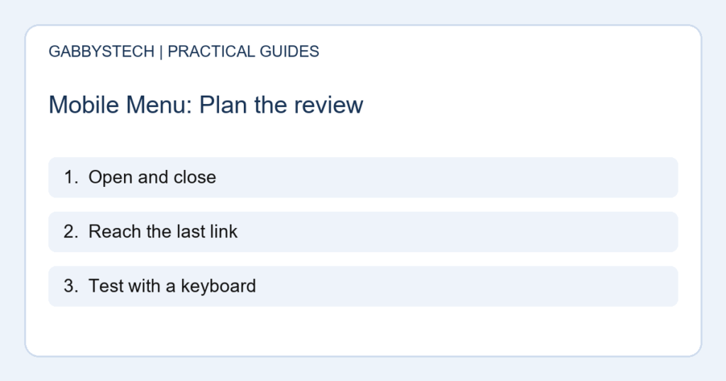
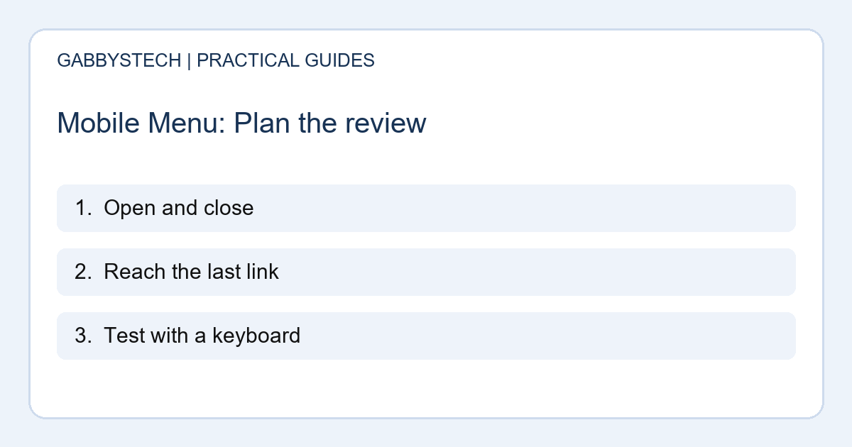
Open the mobile menu and try the close control with both touch and keyboard. Confirm that the page does not become permanently covered when the viewport changes. These are useful checks to discuss with a developer; they are not a substitute for a full accessibility assessment.
3. Reach the final item on a short screen
Test a small screen in portrait and landscape orientation. Open every expanded section and scroll to the final link. A menu that fits on a large desktop preview may overflow on a real phone, especially when browser controls or larger text reduce the visible space.
If the last item cannot be reached, document the screen size and exact steps. The mobile menu needs an appropriate scrolling behavior rather than simply hiding overflow. Check that scrolling the menu does not accidentally leave the page behind it in an unusable position.
4. Use descriptive, distinct labels
Name destinations in language a new visitor recognises. A label such as “Laptop repair” is clearer than an internal department name. Avoid several nearly identical items that lead to different pages without explaining the difference.
Read the mobile menu without the rest of the page visible. Does each item tell someone where it leads? If your site includes customer downloads or subscriptions, make the relevant account route understandable. A marketing page and a signed-in dashboard should not share an ambiguous label that creates false expectations.
5. Check keyboard focus and expanded sections
Use the Tab key to move through the controls and look for a visible focus indicator. Check that expanded sections can be operated without a mouse and that closed sections do not leave confusing invisible links in the keyboard path.
W3C’s menu tutorial provides a useful reference for navigation patterns and keyboard behavior. Ask a developer to investigate any unclear results. A mobile menu that works with a pointer can still present barriers to keyboard users, so record the actual tests instead of assuming visual success means everyone can use it.
6. Review sticky headers and page anchors
A fixed header can make navigation easier, but it must leave enough room for the content. Follow an in-page link and check that its heading is not covered by the header. Try the same journey with larger text and after opening and closing the menu.
Also check that a mobile menu does not hide a cookie notice, form feedback or another essential control. When several layers compete for space, simplify the experience. Screenshots of the actual problem help the designer understand which element blocks the visitor’s next step.
7. Test destinations and keep a record
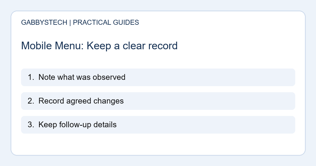
Follow every main link to confirm it opens the intended page. Check external destinations and signed-in areas separately. Make sure visitors can return to the main website without using a browser history trick. Record issues by device, orientation and steps to reproduce.
Repeat the mobile menu review when you add services or change the header. Navigation needs maintenance as the site grows. Better labels and reliable controls support enquiries, but they do not guarantee conversions. The practical goal is that a visitor can find the relevant information and take a clear next step.
Sources and next steps
W3C’s menus tutorial covers structure, styling and interaction. W3C’s writing tips explain meaningful link text and headings.
After testing navigation, review the enquiry journey with our contact form launch checks.
Need help improving a mobile menu or responsive layout? See GabbysTech web design and development and share your website and the problem. Include the device and steps that make the issue appear.