
Contact Form: 7 Essential Checks Before Website Launch
A contact form should help a visitor explain what they need and help your team find that enquiry. Before launching a business website, review the complete journey: the fields, the wording, the experience on a phone and the place where messages arrive. These seven checks turn a visual review into a practical conversation about how enquiries work.
This guide is for business owners reviewing an enquiry page with their designer or developer. It includes a fictional example and a copyable worksheet. It is a starting point for review, not an accessibility certification, a privacy assessment or a guarantee of message delivery.
In this guide
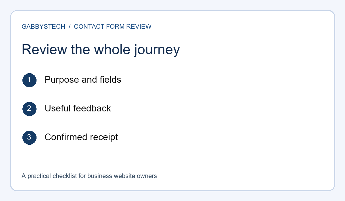
1. Give your contact form a clear purpose
Start with the enquiry you want to receive. A request for a website proposal is different from a repair assessment or a general question. Write down what a visitor needs to explain and what your team needs to decide the next step. This gives each field a reason to exist instead of copying every field from another website.
For example, a small service business might ask for a name, a reply address, a service choice and a short description. That is a planning example, not a universal specification. If a field does not help the first conversation, consider whether it belongs later in the process. Review required fields especially carefully: visitors should understand why they cannot continue without an answer.
Keep the surrounding introduction short and specific. Explain what the contact form is for and which details are helpful. Avoid promising a reply within a particular time unless the business has approved that commitment and can support it. If the enquiry does not book an appointment or confirm an order, make that clear in the wording around the action.
Write a realistic sample enquiry before you review the design. It might say that a business needs three service pages and already has a domain. Ask whether the fields support that message naturally. If the visitor has to choose an unrelated category or invent information to pass validation, the structure needs another look.
2. Check labels, instructions and required fields
Read every label without looking at the placeholder example. Can you still understand what belongs in the field? Labels such as “Email address” and “How can we help?” are easier to discuss than vague labels such as “Details 1.” Decide whether a telephone number is genuinely necessary or simply another optional way to reply.
W3C’s guidance on labeling form controls explains that labels identify the purpose of fields and should be associated with their controls. Ask your developer to check this relationship in the implementation. A label that looks close to an input is not, by appearance alone, evidence that the relationship is correctly represented in the code.
Keep instructions beside the decision they support. If a field expects a particular format, explain it before submission. Make optional and required fields understandable without asking people to infer the rules from colour. Use ordinary examples that do not look like real customer records, and avoid putting all the instructions inside text that disappears when someone begins typing.
Your contact form review should include the actual business wording, not only the developer’s sample content. A long service name, a two-part surname or an international telephone format can reveal assumptions hidden by short examples. Record the intended behaviour and ask for a correction where a legitimate enquiry cannot be entered.
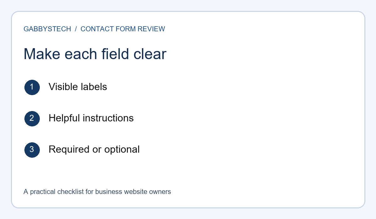
3. Try the contact form on a phone and with a keyboard
Open the real review page on a phone you use, then repeat the main journey on a computer. Read the introduction, enter a sample enquiry, correct a mistake and reach the submission button. Note where instructions become difficult to read or where an on-screen keyboard covers information you need. A screenshot alone does not show whether the journey works.
Check the page at a comfortable text size. Look for clipped labels, narrow message areas and horizontal scrolling that makes a field difficult to follow. Avoid judging the entire experience only from a large desktop monitor. Your aim is to identify specific barriers that can be reproduced, rather than simply ask for the page to be “more mobile friendly.”
On a computer, try moving through the controls with the keyboard. You should be able to identify the current focus and reach the intended actions in a sensible order. Record any point where you become trapped or cannot tell which control is active. Ask the developer to investigate; this practical check does not replace a complete accessibility assessment.
Keep a short test note with the device, browser and page address. “Message box is clipped on my phone in portrait view” is a useful starting point. Adding the visible steps makes it easier to reproduce the problem. You do not need to claim that testing two devices proves the page works for every visitor.
4. Review mistakes and submission feedback
An unfinished enquiry is a useful test case. Leave a required field blank and see whether the contact form explains what needs attention. Then enter an obviously invalid email example and repeat the check. Use safe test values and an agreed testing process; do not send repeated messages into an unattended live inbox without telling the responsible person.
W3C’s form notification guidance recommends clear feedback about success or failure and instructions that help users resolve errors. In your review, ask whether the message names the affected field and gives a practical correction. A generic warning can leave a visitor unsure whether the problem is their entry, their connection or the website.
After fixing one field, check whether the rest of the enquiry remains available. Re-entering a long message can be frustrating. Also review the success wording: it should describe what actually happened. “Your enquiry was submitted” is a different claim from “Your booking is confirmed.” Choose a message that matches the business process and the evidence the application has.
If an error appears during submission, record the exact visible wording and the time of the test without sharing private customer information. Ask the developer what the system knows about that attempt. Avoid repeatedly clicking the button to see whether a second click changes the result; first establish whether the original enquiry may already have been received.
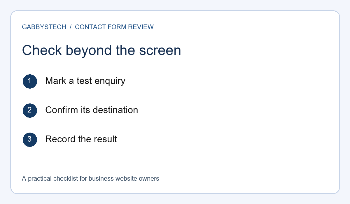
5. Confirm where the enquiry actually arrives
A reassuring message on the screen is only one part of a contact form test. Agree who will check the receiving system, then send a clearly marked test enquiry. Confirm that the intended person can find it and that the message contains the fields needed for a reply. Note the test time so the correct message can be identified.
Follow the complete route used by the website. Depending on the setup, a message might be delivered by email, recorded in an administration screen or passed to another service. Ask which destination is the operational source your team checks. Do not assume that every form stores a second copy or that an email inbox is the only place an enquiry can exist.
Review the sender and reply behaviour with the person responsible for configuration. Can the team reply to the correct address without manually guessing it? Does the message clearly distinguish the visitor’s details from website-generated information? Record a delivery problem as a separate issue from visual layout, even when both are discovered in the same review session.
Keep one successful test as evidence of that particular route, not a permanent guarantee. Delivery can depend on settings and external services that change. Decide who will repeat the contact form check after relevant maintenance and how a staff member should report missing enquiries. The handover should make that responsibility visible.
6. Ask only for information needed at this stage
Read the contact form as a new visitor deciding what to share. Does it request passwords, account recovery codes or documents that are unnecessary for an initial enquiry? Replace those requests with a description of the problem or project. If further access is needed later, agree on an appropriate process separately rather than inviting secrets into a public message field.
Give the business owner a list of the systems that receive or retain enquiries. This can include the website, email delivery service and an agreed customer management tool. Ask who can access each destination and who handles changes. This is an operational inventory, not a claim that the website satisfies every applicable privacy requirement.
Where a privacy notice is provided, make its link readable and check that it opens the correct page. The notice should match the business’s actual handling of enquiries. Do not add a checkbox with legal-sounding wording simply because another website uses one. Have the appropriate owner review the collection and notice requirements for the business and its customers.
For your own review evidence, use fictional sample details and an inbox you control. Screenshots should show the interface problem without exposing a customer’s enquiry. Keep the test notes useful by naming the field and the behaviour, rather than copying personal information into an issue tracker where more people may see it.
7. Record approval and future contact form checks
Finish with a short review record. List the page address, the agreed fields, the receiving destination and the checks that passed. Keep unresolved issues separate so an attractive layout does not accidentally become approval of an untested delivery route. Name the person who can approve the final wording and the person responsible for technical follow-up.
Separate launch requirements from later improvements. A field that prevents a valid enquiry, a missing error message or an unconfirmed destination deserves a clear decision. A different decorative border may be a preference for a later revision. This does not mean appearance is unimportant; it means each decision should be described in terms the whole team can understand.
Agree what happens after a relevant update. If the form plugin, sending service or recipient address changes, the owner needs a way to confirm the enquiry journey still works. A repeatable contact form test is easier to hand over than a vague instruction to “check the website sometimes.” Include the steps and a named recipient for any test message.
Keep access instructions out of the public approval note. Record where authorised staff can find the appropriate internal documentation without inserting passwords or recovery information. The handover should explain ownership and next actions, while sensitive access remains in the business’s approved private system.
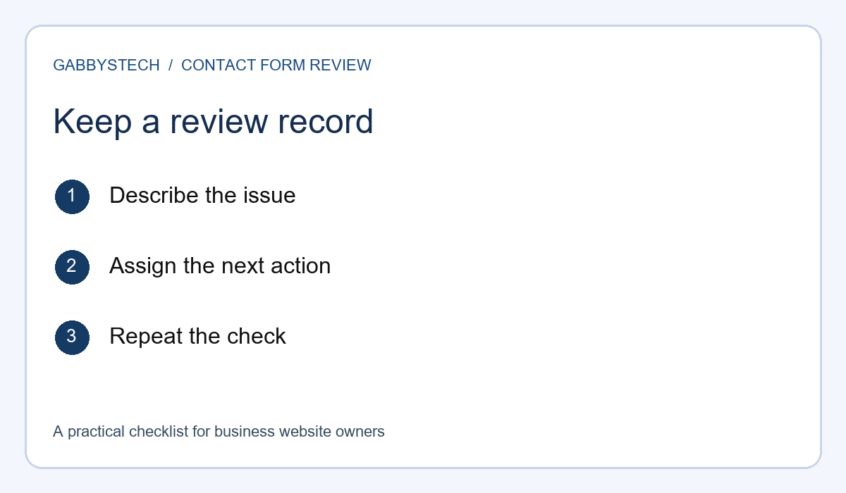
Worked example: reviewing a service enquiry
Imagine a small business preparing a new service page. This is a fictional planning example, not a GabbysTech customer story. The owner wants visitors to request a discussion about a project. The first draft includes a company name, reply email, telephone number, service selection, budget field and message area. The reviewer starts by writing a plausible enquiry in plain language.
During that exercise, the owner decides the telephone number can be optional because email is an acceptable reply method. The budget field needs a “Not sure yet” choice so an early enquiry does not require an invented amount. The introduction explains which project details are useful. These are decisions for this example; another business may need a different set of fields.
Next, a reviewer tries the contact form on a phone and checks the required-field errors. They notice that the service choice is clipped and record the device, orientation and steps. The developer corrects the layout, and the reviewer repeats the same journey. The issue is closed when the intended behaviour can be observed, rather than when someone says the styling was changed.
Finally, the owner sends a marked test message and asks the receiving staff member to confirm its contents. The success notice is revised to say the enquiry was submitted, without implying a confirmed appointment. A review note records who receives messages and which checks should be repeated after a configuration change. The result is a clearer enquiry process, not a promise of more leads.
A contact form review worksheet
Use the prompts below in a shared review document. One observation per row is easier to follow than a long message combining wording, layout and delivery concerns. Add the person responsible for each change and keep a place for the retest result. The worksheet can be adapted to a new website or an existing enquiry page.
- Purpose: What kind of enquiry is this page intended to receive?
- Fields: Which answers are required, optional or better requested later?
- Instructions: Can a new visitor understand what to enter?
- Device check: Which phone and computer were used, and what happened?
- Error check: Does the message identify a useful correction?
- Success check: Does the confirmation describe the actual next step?
- Delivery: Who confirmed receipt, in which agreed destination?
- Approval: What remains unresolved, and who owns the next action?
Choose evidence that answers the question being reviewed. A screenshot can demonstrate a clipped label, while a receiving-system check can demonstrate arrival of a test enquiry. Neither alone proves the complete journey. Record the relevant observation without collecting unnecessary personal details or presenting one successful attempt as universal evidence of reliability.
Common questions before launch
Do we need a long contact form to look professional? Length should follow the information needed for the next step. A short initial enquiry may be appropriate when the details are discussed later. A more structured request may be useful when the team needs specific information to route it. Test a realistic enquiry and remove fields that have no clear purpose.
Is a success message enough to approve the page? Check the receiving destination as well. The visible message tells you what the visitor sees; a delivery check tells you what the responsible team can find. Keep those observations separate in the review record. If one is missing, state the gap plainly instead of assuming that the other proves it.
Can this checklist prove accessibility or privacy compliance? No. It is a practical starting point for discussing an enquiry journey. Specific requirements need appropriate assessment and review. Ask for the scope of any specialist work and the evidence it will produce. Do not describe a few informal checks as certification or a guarantee that every visitor’s needs are covered.
Should the website collect payment details here? An ordinary enquiry field should not be treated as a payment-processing system. If the business needs checkout or booking payments, discuss the appropriate workflow separately. Keep the first conversation focused on the information needed for the service request, and use an agreed payment process for any later transaction.
Discuss a clearer enquiry journey with GabbysTech
GabbysTech offers web design and WordPress development for businesses in the Philippines and worldwide. Share your existing page address, the enquiries you want to receive and the problems you can describe. The next step is a discussion of the scope, content responsibilities and review process for your website.
If you are still organising the wider project, use our website brief planning guide before deciding on individual fields. For a broader content and search review, see the business website SEO checklist. These related guides help place the enquiry page within the visitor’s overall journey.
You can contact GabbysTech to discuss your website. Explain what the current contact form does, what you want it to do and which checks remain unfinished. Leave passwords and private customer records out of the initial enquiry. A clear description gives the discussion a useful starting point without assuming a particular price, timeline or outcome.